Role: UX Designer
Project Length: 8 months
Type: Enterprise dashboards in Power BI
Imagine that you're a Sr. Director of Supply Chain at a Fortune 500 auto parts company, and need to keep an eye on warehouse performance, inventory, and safety incidents. Plus quickly dive into brands, vendors, or product lines during meetings.
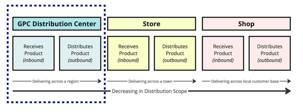
These are some of the use cases I designed for with enterprise dashboards that help Supply Chain leaders analyze data across 53 Distribution Centers, supplying inventory to 6,000+ NAPA Auto Parts stores, other warehouses, and commercial clients like airlines and fleet operators.
I created design standards and reusable components that developers use to build reports for teams like Sales, HR, Pricing, and Finance. These reports, built in Power BI and updated daily via Google BigQuery, support Genuine Parts Company's modern data strategy.
Research
The main users of these reports were internal employees—General Managers, Supply Chain Directors, and Executives. This made scheduling user interviews easier but also meant a smaller user base.
I collaborated with Product Managers and UX Researchers to gather requirements through Discovery Research, from data extraction to analysis. I also brought in Developers early to brainstorm, assess feasibility, and understand technical limits.
Our research focused on identifying key metrics and making data easily accessible for deeper analysis. We conducted interviews with users managing areas like Safety and Performance, with plans to later gather NPS scores and feedback through surveys.
Challenges & Workshopping
There were no design standards, so Power BI developers built reports their own way, leading to inconsistency and accessibility issues. It was a "Wild West" of design debates and rework, with each developer following their own approach.
I worked with the Lead Power BI Developer to create documentation, style guides, and examples based on data visualization best practices. We incorporated insights from books and courses, including the Okabe-Ito color palette, to make reports more accessible for users with color vision deficiencies.
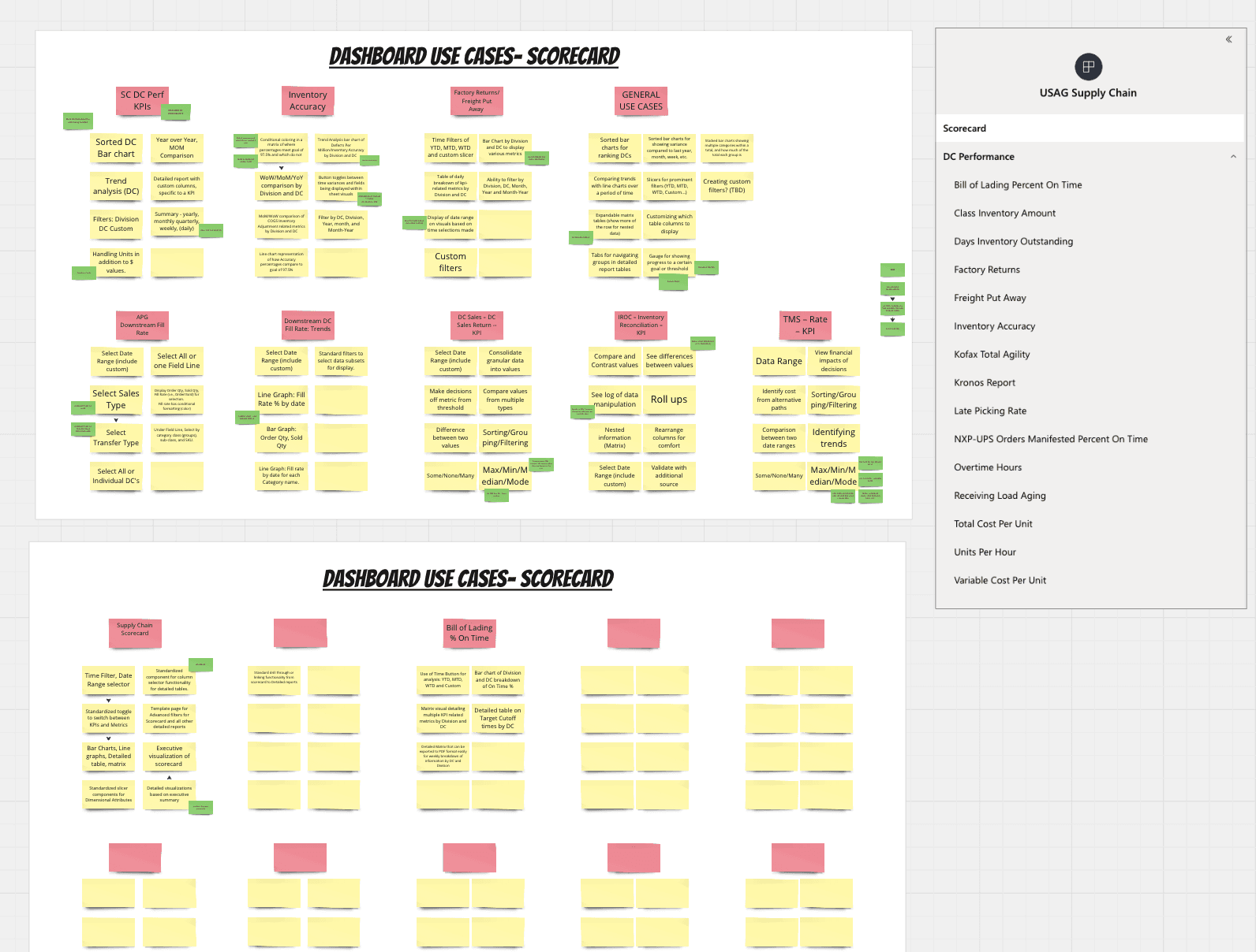
Accessibility was a key focus, ensuring reports worked for all users. I led a workshop to identify common dashboard use cases and worked with developers to create standardized JSON components—essentially reusable building blocks for reports in Power BI.
Examples, Before & After
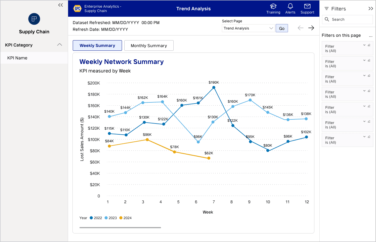
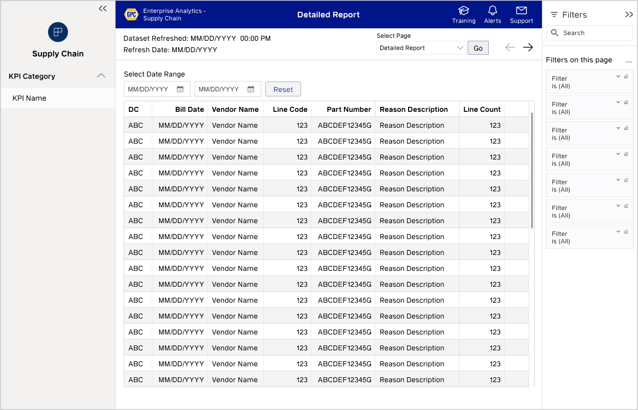
Here are examples of Supply Chain reports I designed, showing the shift from ad-hoc designs to standardized enterprise reports. The goal was to make data clear, easy to understand, and ready for deeper analysis. (Actual data is redacted.)
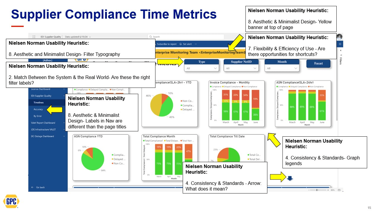
I also conducted heuristic analyses of dashboards for other initiatives, recommending improvements based on our enterprise standards and Nielsen Norman Usability Heuristics, with direct updates in Power BI.
Reflection
With a streamlined workflow and enterprise design standards in place, the team completed projects faster, delivering consistent, accessible data visualizations that met WCAG standards.
The Business gave positive feedback, noting that these reports reduced manual Excel work and eliminated the need to pull data from multiple sources. With data coming directly from the source, confidence in accuracy and decision-making improved.
Future plans include expanding standardized JSON components for Power BI, improving documentation and training, and fully replacing legacy Qlik reports as the company transitions to a modern data platform.

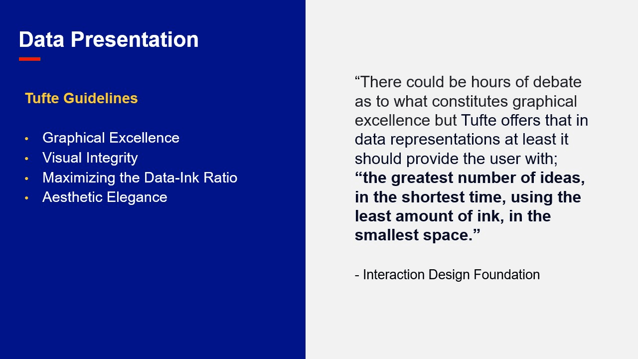
I shared my Data Visualization learnings with the UX Design & Research Team, which deepened my own understanding and sparked great discussions. Here are some of the key books and courses I referenced.

